
 Colour Investigation in Intaglio started in May 2010 and my goal was to work with blacks, oil ink manufactured by Graphic Chemical & Ink Co. as a way to better understand the interaction between the ink and the cooper plate. Eighteen months later, I have tested all the other colours including silver and gold and also two other inks: water based Akua and water washable oil inks Caligo.
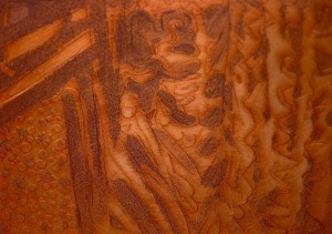 Each plate had a variety of marking techniques on it: dry point, rosin aquatint, spray aquatint, sugar lift and etching. I felt that I had learned so much by that first experiment with the blacks that the project had to be extended to include all the other available colours. Luckily, Professor George Hawken agreed to give me more time and access to the print studio at the Visual Studies Program, Art Department of the University of Toronto.
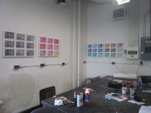
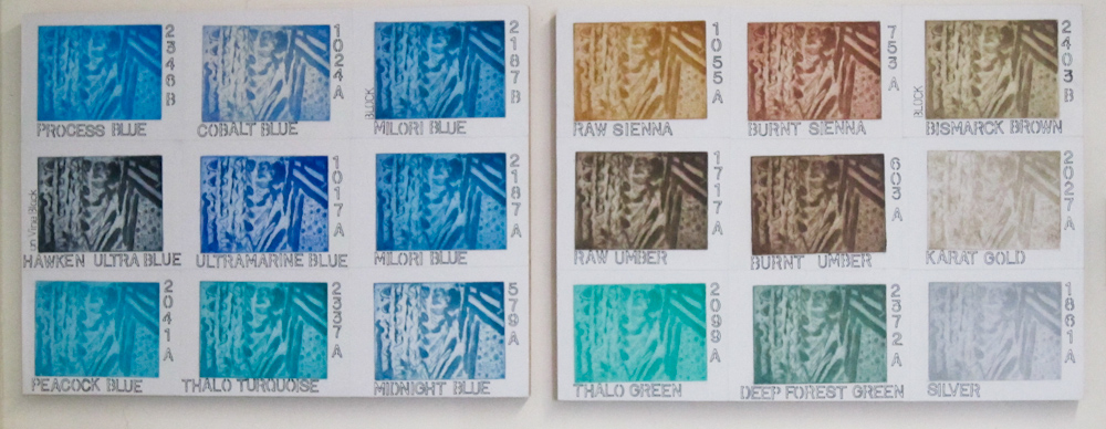
Colours were tested and different methods to control oxidation were applied to the plates to the point where I could compare results and learn about the viscosity, texture and transparency. Swatches of each ink tested were displayed on boards that are now hung at the print studio walls, offering some visual references.
Several times I was questioned on the purpose of this project. Above all, some people close to me could not understand why I kept working on the same plates, focused only on testing the inks and their performance instead of doing something more ‘creative.’ Nevertheless, I was driven into deep understanding of the physicality of the inks, of their intrinsic nature.
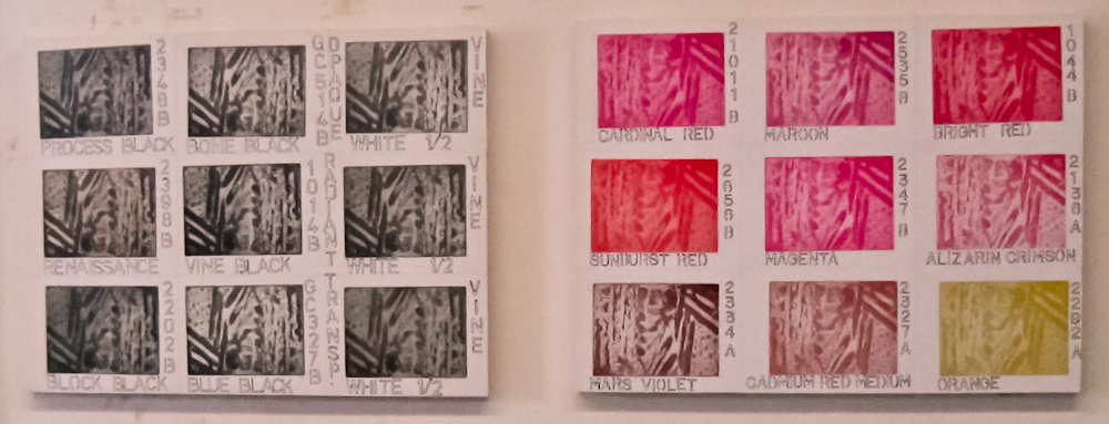 It is important to me to incorporate this ability into my work. It is not just a matter of controlling the process because one cannot avoid the strong element of chance in printmaking. It is more about acquiring familiarity, a tactile relationship with the material. Moreover, it is about how much I learned from my methodical persistence on testing each ink, filling up the spreadsheets with my observations and making it easily available as references. I am glad I kept going, an ink at time and taking the time to understand as much as I could each of them. Only the reds, with their surprising oxidation held me for months trying different solutions and comparing performances.
Now I can get their full saturation or let the reds have more of earthy brownish side. I am happy that I am able to identify the materials not only by their names but also by their nature: transparent or opaque, thick or thin, oily or watery and so on. Anyway, I am now convinced that it is time to move on and it is about time to start producing work that incorporates this valuable learning experience.