
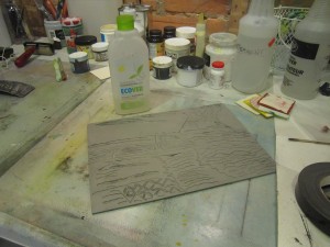
This is printmaking: one has to anticipate how the color will react and interact with the plate, the press and the paper. So, really, what you see is almost never what you get. I have been working on grey tones for most of the Summer. It has been a great summer and painting at the cottage, close to nature, is very inspiring. Exploring the complementaries colours and the tones I can create from it is very rewarding, quite intriguing though. The summer lights offered great opportunities to take pictures of landscapes, flowers and plants.
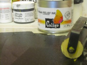
 I have been working on some plates and kept testing new inks. The lastest is CALIGO, a oil based ink for Intaglio and Relief printing that is water washable. It is not as easy to clean as AKUA but it is a great product and I intent to keep exploring it further. However, I have not been sucessful working with AKUA inks on Relief prints. The AKUA ink would not stick to the lino and the result was awful. Then, I learnt that there is a ‘thickner’ fluid which has to be added to the ink and make it suitable for Relief print. As soon as I get it from the US I will test it.