
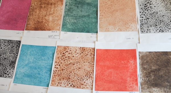
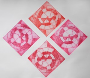
 Due to this project’s educational purposes I have switched from making prints exploring hues individually to making swatches and displaying them on a board to be hung at the print studio. I believe that these visual references will be more effective as an available tool in the studio where comparison is readily possible.
So far, I have tested only Graphic Chemical oil inks. I have already started working with some samples of Akua Water Based inks and it is my intent to make swatches of them as well and place the samples on boards. I have been logging all the observation on the printing spreadsheets and these are the inks I have tested:
BLACKS:
- Vine Black (1014B)
- Bone Black (514B)
- Process Black (2348B)
- Blue Black (327B)
- Renaissance Black (2398B)
- Block Black (2202B)
REDS:
- Sunburst Red (2656B)
- Bright Red (1044B)
- Cardinal Red (21011B)
- Magenta (2347B)
- Cadmium Red Medium (2327A)
- Maroon (2535B)
BROWNS:
- Bismark Brown (2403B)
- Burnt Umber (603A)
- Raw Umber (1717A)
- Burnt Sienna (753A)
- Raw Sienna (1055A)
BLUES:
- Cobalt Blue (1024B)
- Process Blue (2346B)
- Milori Blue (2187B)
- Ultramarine Blue (1017B)
- Thalo Turquoise (2337B)
- Thalo Blue (1016B)
Next Steps: I am waiting for new tubes of Milori blue and ultramarine blue because my later results showed a big difference in tonality compared to tests made in September 2010. For some reason, Milori blue came out very different. I decided to get a new sample as I could not determined what is the cause of the difference. I cleaned the cooper plate again, and re-coated with Permalac but I used the ink from an old cartidge that was at the studio since last year. It could be the change of temperature or maybe the tube had a wrong label.
I asked George Hawken if it could be oxidation but he doubts that it would change the blue so much. Reds and yellows are more likely to oxidize. I also tested orange and the result came very transparent and more like an ochre yellowish colour. So, I will try to ink the plate using rollers instead of swatches of cardboard and see if it makes a difference.
The bright orange (2292A) that comes out of the tube did not translate to the print at all. Once I have solve the ‘milori’ blue mystery and figure out how to deal with the orange, I will move to the greens, yellows, silver and gold. I could not resist and added up some other blues, like ‘peacock’ blue, mars violet and others. All together, references for 32 inks will be made available by the study. Anyone interested in learning more on how each colour interacts with the copper plate will have access to the spreadsheets. So far, there is one first board for reference: the blacks. The plan is to have the project finished by the end of June 2011.